Monday, May 31, 2010

Niagara Fall

Niagara Fall creates these amazing colours for my collection!

Friday, May 28, 2010

Martin Margiela


Martin Margiela_


I found really interesting designer, who does make garments with different textures and display in a concept.
He graduated Royal Academy of Fine arts, Fashion department in Belgium. After 5 years his graduation, He entered Jean Paul Gautier's Studio in Paris for a design assistant.
In 1988, He found his first headquarters with Jenny Meirens.


his concept store_
_Maison Martin Margiela decorates l'lle aux Oiseaux suite at Les Sources de Caudalie_

It has a blend of white, grey, black and bright red colour with second hand furniture. This chic as well as vintage concept are well mixed and matched with his ideas. I personally enjoyed to look at the colour palette as I also use them as my collection.

_collection "Artisandal" for women and men_

Shifted body-dress
A vintage dress from the 1950s made of lace, voile and tulle is shifted to become a one-sleeve body. The bustier and both straps of the dress are hugging the body while the full skirt is turned into a big sleeve of ruffles.

Metal cape and feathers
A graphic cape is made of strings of hundreds of metal tubes. Ostrich feather boa scarves are going through this metal net.


Mirror structure-dress
Double-face mirror plexiglas is gathered with big beads to create a garment structure opened in the back.

Wild boys go Girly_JFW_2010

PHENOMENON_Designer: Takeshi Osumi


Takeshi tried to experiment with
the new silhouette of menswear.
I think he has a unique interpretation of
what men have to wear.
A pleated ankle length shirts add a little
girly look, but with
rebellious model's facial expression it does not
girly anymore.
It's even more looking masculine..


JFW_2010

I put some interesting design photos
from Japan Fashion Week.

There are quite traditional but contemporary
design of Japanese designers.
The colours were tends to add
subtle and clean modern feel.

Araisara


YUMA KOSHINO
Motonari Ono
Takumi Hatakeyama
Tokuko 1er Vol

Real to Unreal_JFW_2010

This time, I concentrate to look at
the different textile designs throughout
the Japan Fashion Week.
Few designers created very interesting
Prints and dyeing design through their work.

1. Digital prints
Sophisticated and complex art works
are matched well with light coloured fabrics.


MINT DESIGNS_Designer: Hokuto Katsui /Nao Yagi


2. Dye technique
this kind of technique will used for my collection.


HIROKO KOSHINO_Designer: コシノ ヒロコ

Platonic colour-holic_Japan Fashion Week_2010

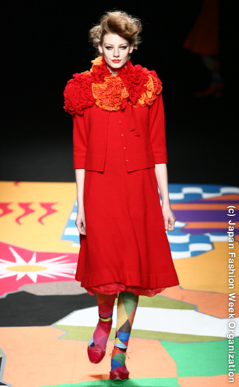
Firstly when I look at these
designers collections, I was shocked, because of the
using opposite colours that matches perfectly.

Their use of these dominant and various colours
within the collection was not odd at all.
I guess that's because of the colours
were toned down a little bit to be
able to mix well.

Again, give the designer a big hand!


everlasting Sprout_Designer: 村松 啓市


This designer introduce twist and knotting
embellishment on the garments which can be
used as a tool to balance the proportion.
Again, Nice modern colour palette.


Satoru_Matsuda_Designer: 松田 悟

amazing colour choices with wool and jersey
fabrication!


SHIDA TATSUYA_Designer: 信太 達哉